Finastra simplified money movement solution
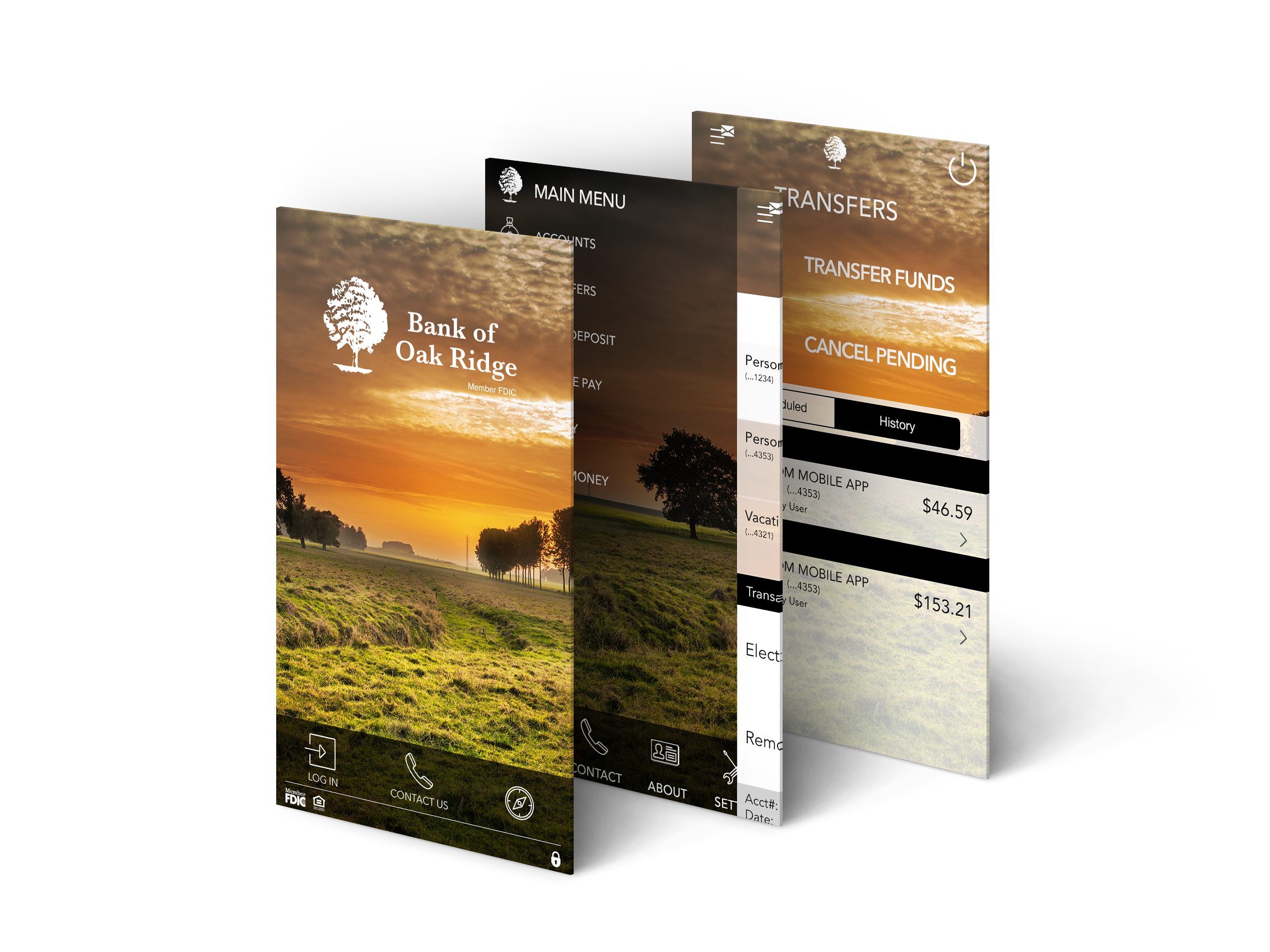
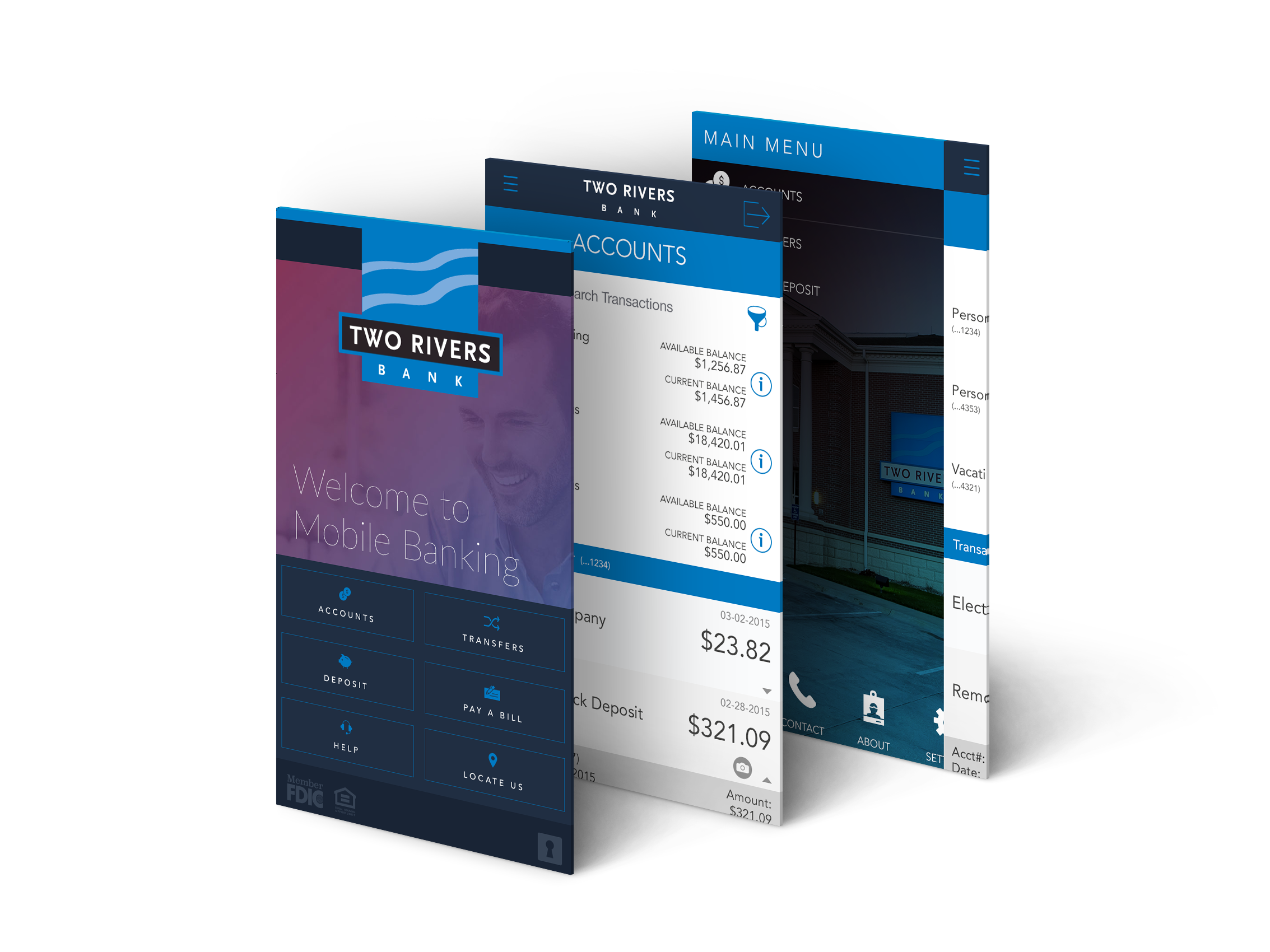
The North American leg of the Finastra User Experience and Design team created a simplified and combined money movement experience for Finastra’s mobile banking applications in order to simplify the transfer and payment flows, reduce redundancies and modernize the existing UI.
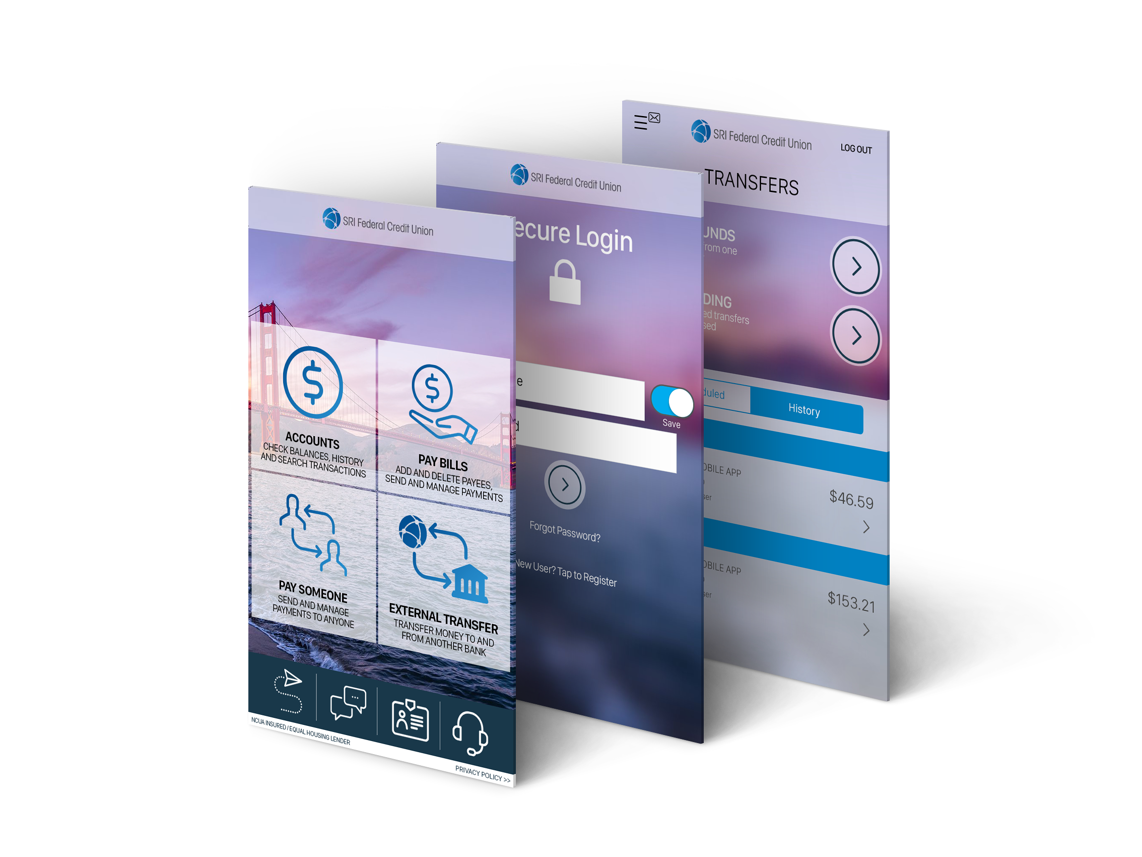
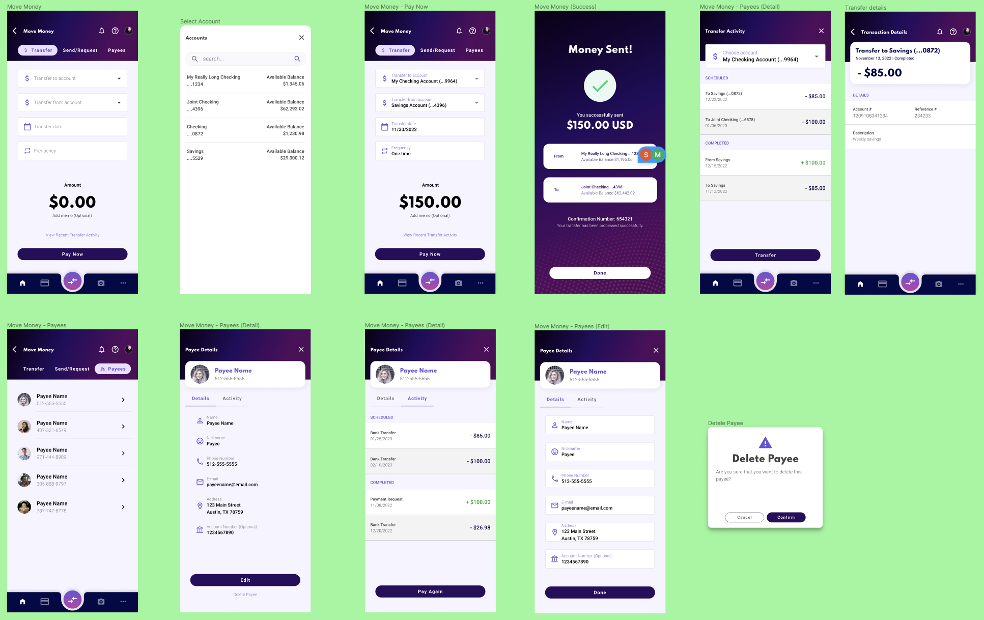
Overview: As part of the second phase of the annual overhaul of Finastra’s digital banking offering, our team worked to streamline and simplify the workflows of moving money within the app. This included the reduction of redundant features, reducing clicks for task completion, and updating the UI to match the new design for the dashboard and accounts views.
Duration: 6 months
Team: UX Designer (me), Junior UX Designer, and Senior UX Designer.
My Role: In my role as a UX Designer, I worked as a main contributor to the project by helping to define phase objectives with Product and management, conducting user testing and research, and to organize and facilitating bi-weekly progress meetings with the team, and presenting findings to other stakeholders.
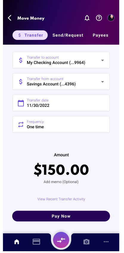
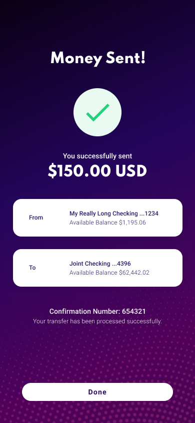
Objectives: Our goal was to design an intuitive layout, solving for the reduction and combination of several similar features in order to increase the speed of making internal and external transfers for the user. We planned to accomplish this by promoting performance gains, minimizing implementation time, and adding the ability for Quick Transfers. In doing so, we hope to differentiate our mobile offering from existing move-money applications.
Process:
- Project goals
- Competitive research
- Personas
- Sketches & wireframes
- Analysis
- High fidelity prototypes
- User testing
- Iterations
- Developer handoff
- UX validation
Competitive Research: Venmo, Zelle, Cash App, Google Pay, PayPal, Bank of America, Wells Fargo, USAA, and Capital One.
Analytics: After completing the competitor research, the next step was to take this data and combine it with findings from our own internal analytics tool. Our main goal here was to dig deeper into customer usage.
- What are the main features being used? How often?
- How many move money features do account holders have?
- How often are users moving money between their accounts? To external accounts?
- What are the main pain points within the move money workflows?
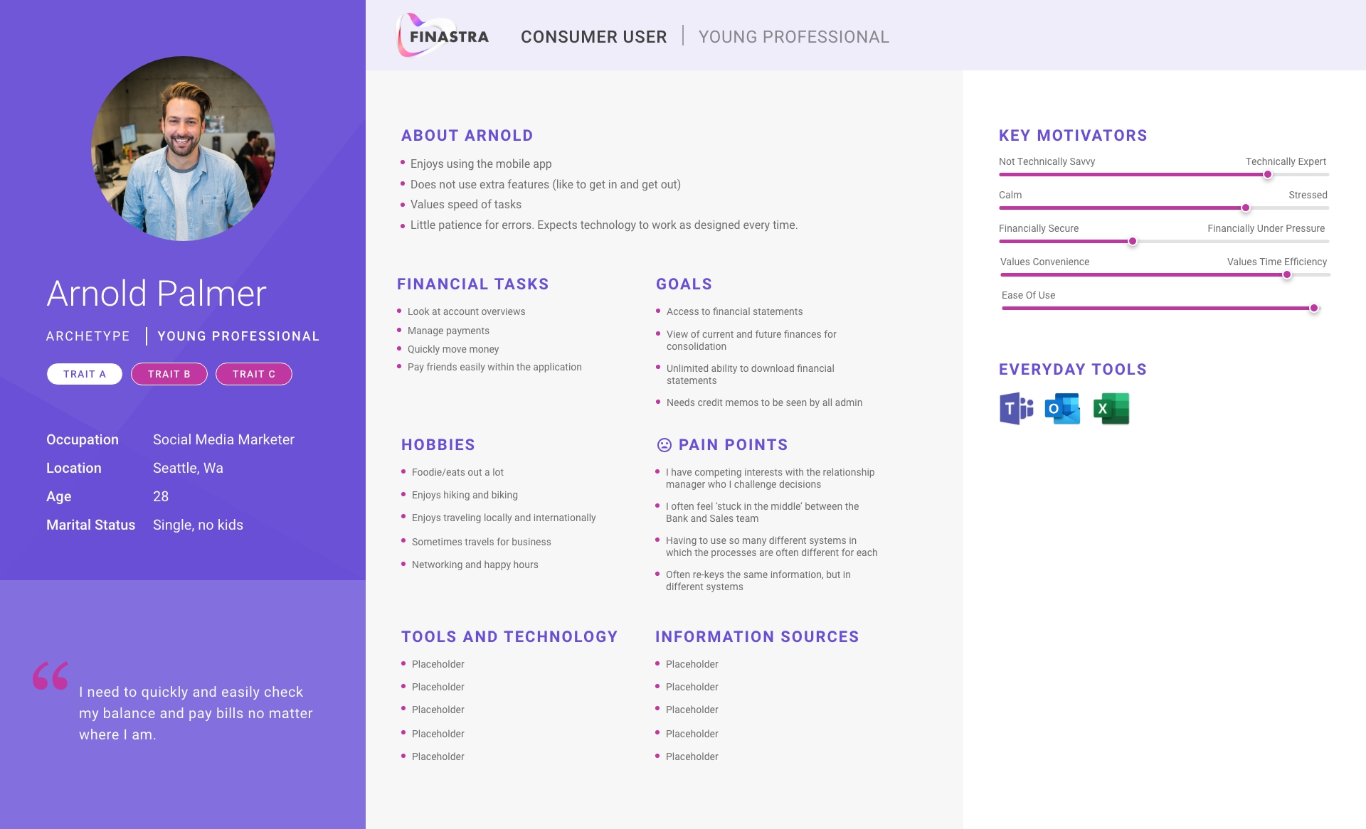
Personas: Based on the data analytics and research, we set up three personas. We referred to them throughout the entire design and development process.
- Name
- Age
- Archetype
- Main goals
- Touch Points
- Pain Points
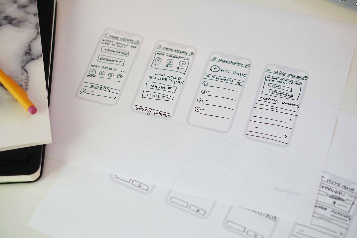
Sketches & Wireframes: I always start the design process with sketches and low-fidelity wireframes. This is the way I can iterate through many designs quickly without worrying if things are too precise.
- The main purpose of my sketches was to brainstorm initial ideas for the consolidated move money landing screen and to quickly share designs with the team.
- Since the user’s main goal is to make an internal transfer as quickly as possible, I used sketches to come up with ideas to provide convenient shortcuts.
- In this round of sketches, I explored the differences between the top widget card on the money movement dashboard and the idea of a Quick Transfer.
- These quick sketches helped me visualize and communicate the different landing screen options with other team members and stakeholders and helped dictate which versions we moved forward with for prototyping and user testing.
User Testing: I worked alongside another UX Designer to perform user testing on phases one and two of our designs. For the first round of testing, we ran 10 unmoderated A/B tests using usertesting.com to gain initial feedback on iPhone prototypes of the main Move Money landing page. We worked together to create screener questions, task lists, and surveys in order to gather insights into the dashboard layouts.
Once the first round of testing was completed, we analyzed the results and iterated our designs based on the feedback received. From the first round, we eliminated Option C as the users felt the history list provided minimal value on the main move money screen. Combining options A and B, we completed the second round of User Testing and found a clear winner between the two.
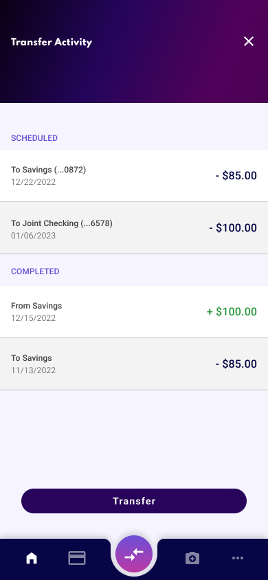
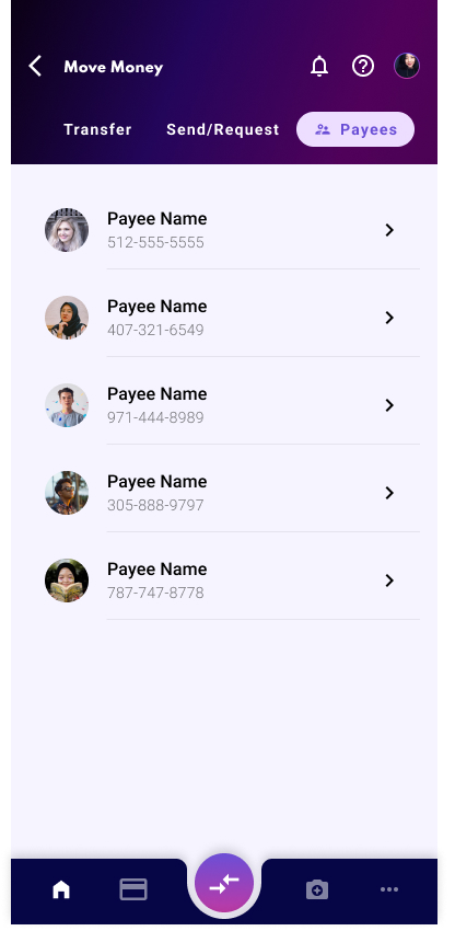
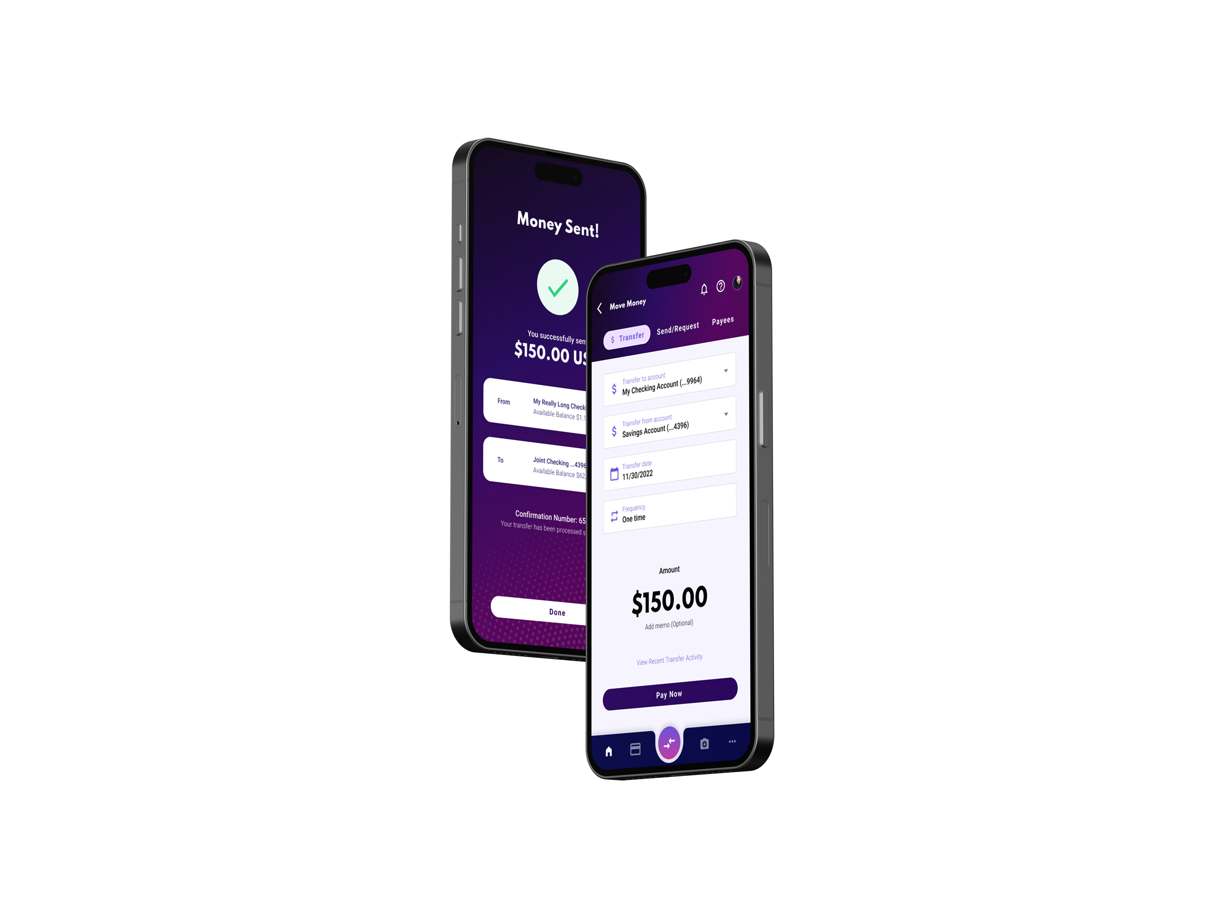
Final Designs:
Tools: Figma, Adobe XD, Illustrator & Photoshop / Confluence / Excel / UserTesting
Skills: User Testing / Lo and Hi Fidelity Wireframes / Prototyping / Visual Design