
The UX problem that steered maternal mortality rate in Texas
The highly publicized maternal mortality rate in Texas was more than a clerical problem. While some were going straight to politics to blame for the issue, others were just neglecting women’s health, but maternal mortality rates were multiplying so fast that there was suspicion as to what really was going on. After reading several articles and analyzing the experts, it was clear that this was a UX problem that could have been fixed easily.
Here is an excerpt from an article written by Sarah Chodosh for Popular Science:
The authors also note that the number of death certificates being submitted electronically in Texas jumped from 63 to 91 percent from 2010 to 2012. Having a bunch of new users entering information into death certificate software may have exacerbated the misreporting.
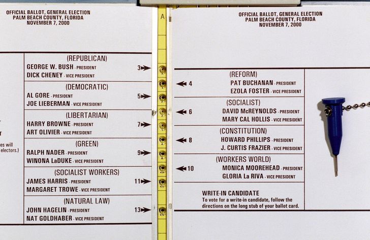
While training employees is important, having a good experience when filling out such an important and stressful form is equally as important. This takes us back to a similar design issue that cost Al Gore plenty of voters in Palm Beach County in Florida back in 2000.
So how can we fix this? Has Texas implemented a plan to improve this? While there is no information regarding this, the State of Texas and the Texas Maternal Mortality and Morbidity Task Force can take some steps to improve the usability of their form:
- Conduct a usability research session: This is essential to understand what and why you are analyzing components of an existing product. It is important to consider that the insights of the team implementing the software might be different than the users. Don’t ever assume what users will do because the purpose of designing for users is to learn new things, not to hold onto an idea of what you think they want.Doing research to analyze solutions saves time and money too because the focus is placed on finding pain points with how someone uses a product that is needing improvement.
- Implement research findings: Answering these questions lead to design effectiveness because they take user perspective and behavior into consideration. Design research can either be qualitative or quantitative. The basic focus is the context of research and applicability of the technique for the particular design. The design team analyzes the research data and comes out with action-oriented results through storyboards, mental models, etc. It helps to understand user information, skill level, motivation, and the belief systems of users. Usability testing unveils the actual interaction of users with the system because what users might feel sometimes differs from what they actually do.A prototype can be employed for usability/user testing through various research techniques. Guerrilla research is done on the spot with users or through remote research where users are involved through online interaction. The convenience factor is higher in remote research. But at the end of the day, the most important part of this process is to wireframe and prototype a scenario based on the results of your research.
- Prototype: A prototype is not the final product. Depending on the detail of your prototype, this sometimes needs to be (re)communicated to the parties involved. While there is a case to be made for how prototyping can save time and money, the prototyping process itself can be costly and time-consuming if a vision is not clear. Typically though, prototyping can help designers quickly and relatively easily navigate through the limitations of a design and get it as close to a working model as possible, which is precisely the point. That’s where prototyping has its opportunity to shine—when it clearly shows how a design communicates and achieves the desired goal. Here is an example of how a drop-down can be more functional:
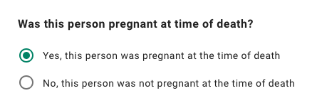 By using a radio button there are only two options to choose from and by the help of clear copy, this should allow users to understand the question and clearly make a clear choice. Users should be able to make better choices when filling out their forms when they are presenting with a usable interface.
To conclude, users can be reluctant to fill out forms, so make the process as easy as possible. Minor changes — such as grouping related fields and indicating what information goes in each field — can significantly increase usability. Usability testing is simply indispensable in form design. Very often, testing with just a few people or simply asking a colleague to go through a prototype can give you a good insight into how usable a form is.